Whitelabelling
Your app CSS
Using tags and custom fields to manage CSS and icon urls
Overview
When building an application based on Tray Embedded, it is important to remember that there are basically two UI components that you will need to configure and style with CSS:
- Your application interface which presents the available Solutions to your End Users, including the option to click and configure a Solution Instance for their own use. This is not a Tray component and so is entirely controlled by you, using tags and custom fields to assist as explained below.
- The Configuration Wizard which is triggered when the End User clicks to configure a Solution Instance. This is a Tray component and instructions for adjusting the Config Wizard CSS are found in the next page in this section.
Application UI mockup
The following is a simple mockup of how your application interface might look in terms of presenting your Solutions to your End Users:

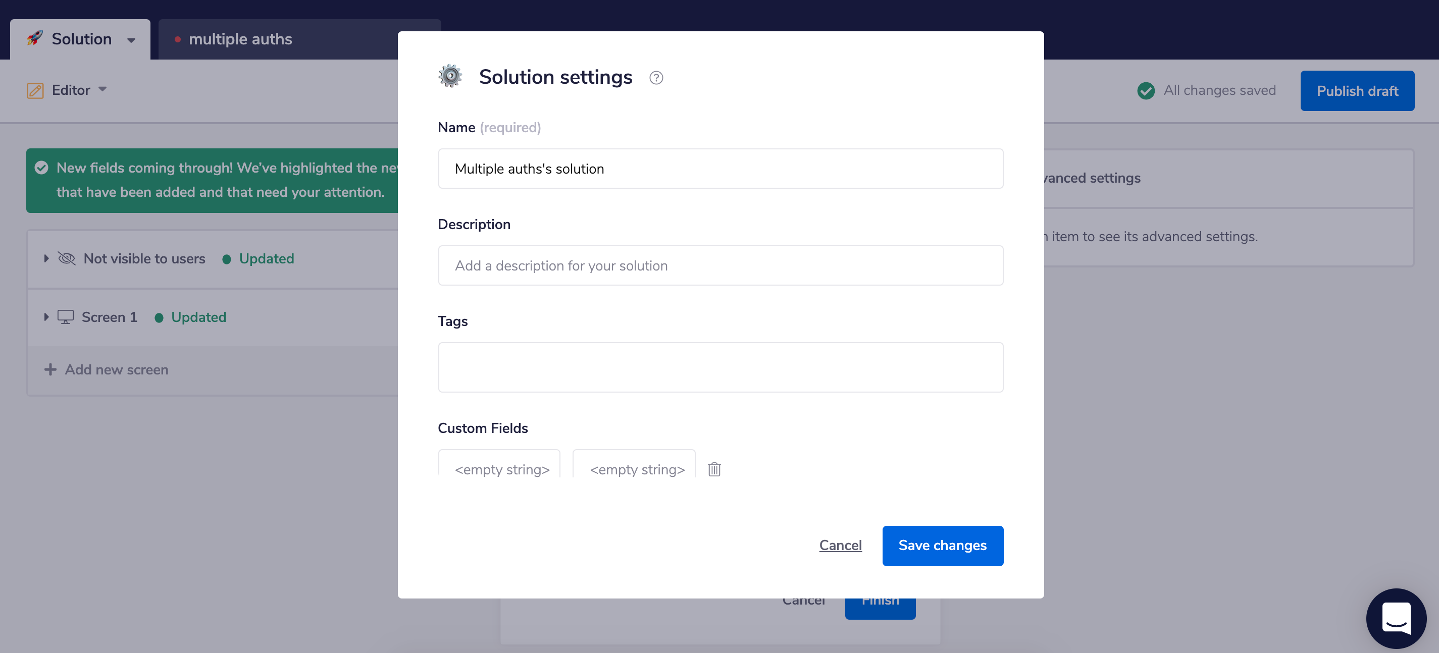
Using tags and custom fields to manage CSS and icon urls
In order to assist you in filtering Solutions and creating classes for box styling and display of icons, you can use Tags and Custom Fields in the Solution Editor:
 Then your app can use a GraphQL (see our intro to Tray Embedded GraphQL) List Solutions query such as:
query {
  viewer {
   solutions (criteria: {tags: "two-service"}){
    edges {
     node {
      id
      title
      description
      tags
      customFields {
       key
       value
      }
     }
     cursor
    }
    pageInfo {
     endCursor
     hasNextPage
    }
   }
  }
 }
This will then return results such as:
{
 "data": {
  "viewer": {
   "solutions": {
    "edges": [
     {
      "node": {
       "id": "e2ed06d9-f56c-4eda-a1dd-218ae63a30b6",
       "title": "Salesforce Accounts > Asana Tasks",
       "description": "Set Salesforce Tasks to sync to Asana",
       "tags": [
        "salesforce",
        "asana",
        "two-service"
       ],
       "customFields": [
        \{
         "key": "icon-url",
         "value": "\\"https://icons.com/salesforce-asana.png\\""
        \}
       ]
      },
      "cursor": "ZTJlZDA2ZDktZjU2Yy00ZWRhLWExZGQtMjE4YWU2M2EzMGI2"
     }
    ],
    "pageInfo": \{
     "endCursor": "ZTJlZDA2ZDktZjU2Yy00ZWRhLWExZGQtMjE4YWU2M2EzMGI2",
     "hasNextPage": false
    \}
   }
  }
 }
}